20 Great (and 20 not so great) Logo RedesignsJack in the box
The new logo for Jack In The Box is modern, fun, and quirky - just like their mascot (Jack). The brand extensions for the different types of sandwiches they offer are also fun. The only thing off about the new logo is the “in the box” text that just seems to be placed under the image as an afterthought. This project was designed by Duffy & partners.
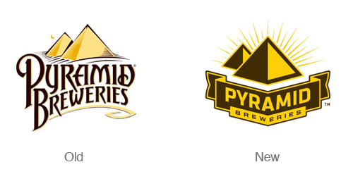
Pyramid Beer
The redesign of the Pyramid Breweries Logo is simple and distinctive. The new logo places more emphasis on the geometric pyramid symbol. The type in the new logo is also much easier to read. The new simplified logo communicates boldness and distinctiveness. The new logo is also accompanied by several new and bold label designs.
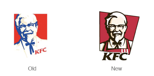
Kentucky fried chicken
KFC has a nice refresh of their logo - The colonel has taken off his suit coat and put on an apron - like he’s ready to serve you. This version of the logo is much friendlier and inviting. The new angled backdrop to the logo also adds a nice dynamic feel and implies quickness - this isn’t a sit down restaurant! The only thing I don’t enjoy about this redesign is the integration of the type into the symbol. It feels like the type should be more of a separate element rather than attempting to integrate it with the illustration.
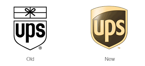
UPS
Paul Rand is probably rolling over in his grave over this redesign. UPS decided to re-brand themselves a few years ago (2003 to be exact). The new design feels much more modern and and clean. That being said I could do without the 3d effects. The logo was designed by New York-based FutureBrand.
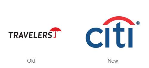
Citi

Can you imagine designing a logo in just a few seconds (and 34 years of experience)? Paula Scher did just that in a client meeting with then named Travelers group insurance. The company was re-branding but wanted to maintain their distinctive umbrella symbol. This logo is simple and brilliant in the way it combines a simplified version of an umbrella and simplified type. Designed by Pentagram.
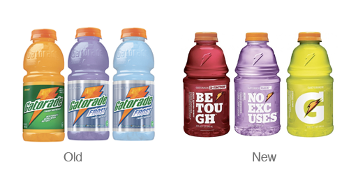
Gatorade
Gatorade is the only part of the Pepsi re-branding scheme that I actually enjoy. I love the new simplified G and lightning bolt. I’m also quite fond of the bulky slab serif font used on their packaging.
Read More...By
Niki Brown